Your stores are answering the same survey very differently. One site says morale is fine. Another loses people every month. A hospital unit reports strong teamwork on paper while callouts keep rising. That’s exactly where frontline employee eNPS helps, if you use it as an operations signal, not a culture slogan. For deskless teams, eNPS is the percentage of promoters minus the percentage of detractors from a single 0 to 10 recommendation question, and its real value is showing where shift fairness, manager consistency, and communication reach are breaking down.
Key Takeaways
- Frontline eNPS is useful because it is simple, but it only works when you segment results by site, shift, role, and manager.
- Benchmarks matter less than comparability. A score that looks acceptable at enterprise level can still hide a failing region or unit.
- Channel choice is not a side issue. Frontline listening fails when the survey only reaches office-connected employees.
- eNPS should sit beside operating metrics, not apart from them. Pair it with absence, turnover, safety, quality, and service.
- Survey fatigue ruins data quality fast. More listening is not better listening.
What Frontline eNPS Is and Why It Matters in 2026
Frontline eNPS is the Employee Net Promoter Score adapted for deskless workers. It asks whether people would recommend the organization as a place to work, then calculates the result as % promoters minus % detractors, with passives excluded. The score runs from -100 to +100, and many HR references treat scores below 0 as weak, 10 to 30 as good, and above 50 as excellent, based on the standardized eNPS method outlined by AIHR’s explanation of employee Net Promoter Score.
That definition matters, but the operational context matters more. In frontline settings, this isn’t mostly about values posters or employer branding copy. It’s about whether staff can work a predictable schedule, whether supervisors are fair, whether information reaches every shift, and whether the tool you use reaches non-desk employees.
Why 2026 changes the conversation
Frontline listening is no longer a side project run by a well-meaning HR team. It’s becoming a management discipline. Annual frontline studies are now being published as an ongoing practice, and a 2026 frontline worker report highlighted measurable differences across key frontline measures, including 75.1% versus 66.0%, a +9.1 percentage-point gap, and another measure at 51.0% reflecting a +47.3% relative lift. The same source also notes that a 2024 retail frontline study found nearly 40% of respondents were neutral or dissatisfied with their jobs, which is exactly why sentiment tracking is now used to surface retention risk in frontline-heavy sectors such as retail, hospitality, healthcare, manufacturing, and transportation in GoHappy’s state of the frontline worker reporting.
Practical rule: If your frontline score is collected through office-style channels, you are not measuring the frontline workforce. You are measuring the reachable workforce.
Why eNPS still earns a place in frontline programs
It’s standardized. It’s easy for line leaders to understand. It can be tracked over time and segmented by location or job type across large distributed workforces, which is one reason it became a common shorthand for employee sentiment in the first place, as described in Turn On Work’s guide to measuring employee engagement for frontline teams.
That said, enps frontline only becomes meaningful when it is used as a diagnostic entry point. A single score can tell you where to look. It cannot tell you what to fix unless you pair it with open comments, manager context, and workforce operations data.
Frontline eNPS Benchmarks You Can Actually Trust
Trust industry-specific, context-aware benchmarks. Ignore glossy global averages. Frontline and deskless work is too uneven across sectors, workforce models, and operating conditions for one headline number to guide action.
Published frontline benchmark guidance already points in that direction. For frontline workforces in retail, hospitality, and healthcare, eNPS benchmarks often sit in the single digits to the low +20s, and the practical recommendation is to calculate the score and then segment by team, location, and region rather than rely on one enterprise average, according to Ordio’s frontline eNPS glossary.
What a credible benchmark looks like
A useful benchmark does three things:
- Separates industries
- Acknowledges operating context
- Supports like-for-like comparison
Another strong benchmark source also makes the point that eNPS should be paired with absence, turnover, safety, quality, and service metrics because results vary sharply by sector and company size. That source reports retail at -5, healthcare at 15, hospitality at 30, and government at -15, while organizations with 0 to 250 employees averaged 30 versus 9 for organizations with 5001+ employees, showing that size and complexity materially affect scores in Yoobic’s discussion of frontline engagement metrics.
2026 Frontline eNPS Benchmarks by Sector
| Sector | Typical Range | Credible Source Signal | Red Flag |
|---|---|---|---|
| Retail | Often low, including negative in some benchmark sets | Industry-specific reporting, segmented by site | Corporate-wide average with no store view |
| Healthcare | Often in the low positive range | Benchmarks paired with manager and operational context | Comparing clinical units to HQ staff |
| Hospitality | Can be higher than retail in some published sets | Sample separated by workforce type | Mixed data from franchise and corporate teams with no split |
| Government | Can be negative in published benchmark sets | Context on size and structure | Using it as a reference for private-sector frontline teams |
| Cross-industry composite | Usually noisy | Only useful when sample design is disclosed | “Global average” with no methodology |
If you want a cleaner grounding in baseline engagement measurement before using eNPS, Turn On Work’s broader guide to how to measure employee engagement is the better place to start.
A negative frontline eNPS is not a data error. It usually means you have more detractors than promoters in a specific operating environment, and you need to inspect that environment quickly.
The benchmark that matters most is your own trend by location, role, and shift. If one region climbs while another slides, that tells you more than any vendor PDF ever will.
How to Calculate eNPS for Frontline Teams
The formula is simple. The segmentation is where the value is. Frontline eNPS uses the standard employee Net Promoter Score method: ask how likely employees are to recommend your organization as a place to work on a 0 to 10 scale, classify 9 to 10 as promoters, 7 to 8 as passives, and 0 to 6 as detractors, then subtract the percentage of detractors from the percentage of promoters.
The calculation in practice
Use this sequence:
- Count promoters. These are the people who answered 9 or 10.
- Count passives. These are 7 or 8. Track them, but don’t include them in the final formula.
- Count detractors. These are 0 through 6.
- Convert each group to a percentage of total responses.
- Subtract detractors from promoters.
That gives you the eNPS score.
What frontline teams should report with the score
Don’t stop at one number. Report:
- Promoter share
- Passive share
- Detractor share
- Final eNPS
- Segment cuts by site, shift, tenure band, and manager
That last step is where many teams fail. Two stores can both post the same score and still have completely different operating problems. One may have a healthy promoter base plus a chunk of passives. Another may have a polarized workforce with strong advocates and strong detractors at the same time. Those are not the same intervention cases.
For multilingual workforces, keep the wording identical across translations. For rotating shifts, hold the collection window long enough to reach every shift pattern. For seasonal populations, tag them as a separate segment instead of blending them into a trend line that leadership will later misread.
If you need help making sense of open comments after the score lands, Turn On Work’s guide to analyzing employee survey answers is useful because the diagnosis usually sits in the text, not the top-line number.
Best Survey Channels for Frontline and Deskless Teams
Use mobile-first channels or don’t bother. Frontline employee survey programs fail when leaders copy office habits and push everything through email or intranet channels that large parts of the workforce rarely use.
That failure is already visible in communication research. A 2025 internal communications report found that 60% of internal comms leaders struggle to engage frontline workers, 53% report low intranet engagement, and 47% cite outdated information as a top challenge, which is a blunt reminder that channel mismatch is structural, not cosmetic, in Sociabble’s frontline communication study.
Frontline eNPS Survey Channels Compared
| Channel | Typical Response Rate | Reach by Shift | Fatigue Risk | Cost per Survey | Best Use Case |
|---|---|---|---|---|---|
| Native mobile app | Varies by adoption | Strong where app usage already exists | Medium | Medium | Organizations with established employee app habits |
| SMS short-link | Strong in many deskless settings | High across distributed shifts | Medium | Low to medium | Retail, logistics, field teams |
| QR code | Uneven without reinforcement | Good as always-on access point | Low to medium | Low | Posters, paystub inserts, break-room signage |
| Kiosk or shared tablet | Useful where phones are restricted | Good on-site, weaker for mobile staff | Medium | Medium | Manufacturing, healthcare, controlled floors |
| Manager-led tablet conversation | Selective, not universal | Depends on manager consistency | High if overused | Medium | Follow-up use, not primary survey channel |
Channel limits leaders keep ignoring
A 2025 study of 3,574 employees across several countries found that only 9% of non-desk employees were very satisfied with internal communication quality, while 38% rated it only fair or poor. Separate 2025 reporting based on 800 frontline employees in North America found workers spent 376 hours per year searching for, waiting on, or redoing tasks because information was inaccessible, which shows how badly communication failures spill into operations in Workvivo’s frontline gap reporting.
That’s why I don’t recommend email as the backbone of a frontline eNPS survey. Email reaches the easiest people to reach. It misses the population you most need to hear from.
The channel mix that usually works
My default view is simple:
- Use one push channel. SMS is often the most practical option in retail, logistics, and field operations.
- Use one always-on backup. QR or kiosk works well when workers need a second path or phone access is restricted.
- Keep the instrument short. The longer the survey, the more your channel weaknesses show up.
- Separate collection from supervision. Manager-facilitated access is fine. Manager-controlled submission is not.
If you’re evaluating platforms that support pulse surveys, mobile collection, and frontline feedback workflows, Turn On Work’s survey and pulse feedback tools roundup is a practical starting point. For organizations managing distributed or deskless teams, an employee engagement platform can also provide mobile access to surveys, communications, recognition, and other workforce engagement tools.
Running a Frontline eNPS Program That Gets Real Data
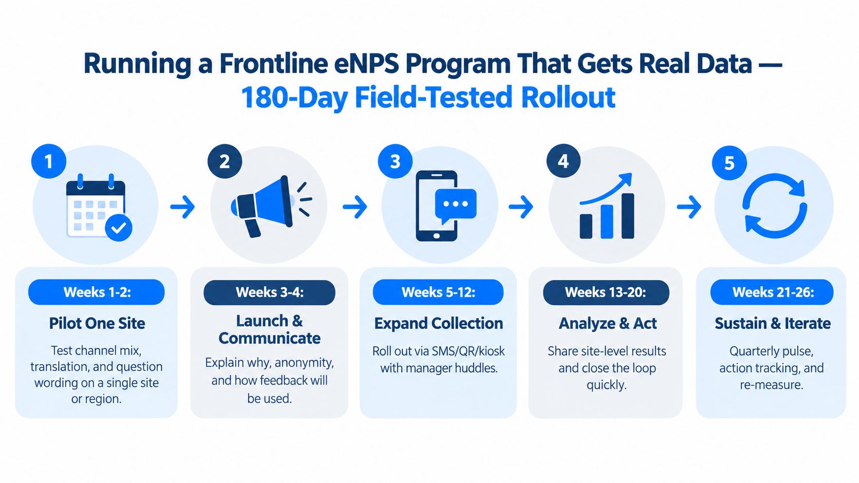
Start narrow, prove access, then scale with discipline. Frontline listening breaks when teams launch enterprise-wide before they’ve tested language, reach, and manager behavior on the ground.
A practical rollout sequence
Use a phased rollout instead of a big-bang launch.
- Pilot one site or region first. Test survey access, translation quality, and whether workers understand the question the same way.
- Explain anonymity before launch. Frontline workers won’t trust a new survey just because HR says they should.
- Expand with the fewest possible channels. More channels create overlap, confusion, and messy governance.
- Route comments fast. District or unit leaders need verbatim input while it is still operationally relevant.
- Show visible action. If teams don’t see change, participation erodes.
Keep the survey instrument tight
For most frontline employee engagement programs, the core survey should include:
- The single eNPS question
- One open-text follow-up
- A very small number of operational driver questions when needed
Many teams sabotage themselves. They say they are launching a pulse, then turn it into a mini census survey. Don’t.
A separate 2025 workforce research report found that 80% of respondents rated frontline engagement as extremely or very important, 84% said they communicate with frontline employees at least one to two times per week, and employee feedback remained the top KPI for internal communicators at 67%, according to Sociabble’s workforce communication research. High communication frequency does not justify bloated survey design. If anything, it raises the bar for clarity.
Close the loop like operators, not presenters
The reporting rhythm should be practical:
- Local leaders get site-level feedback quickly
- HR consolidates themes across locations
- Executives review movement and drivers, not just the score
- Teams hear what changed because of their input
For a more complete operating model for this kind of work, Turn On Work’s employee listening strategy guide is the right companion resource.
The board does not need another sentiment dashboard. It needs a short list of frontline conditions that leaders will fix and a re-measurement date.
What Actually Moves Frontline eNPS
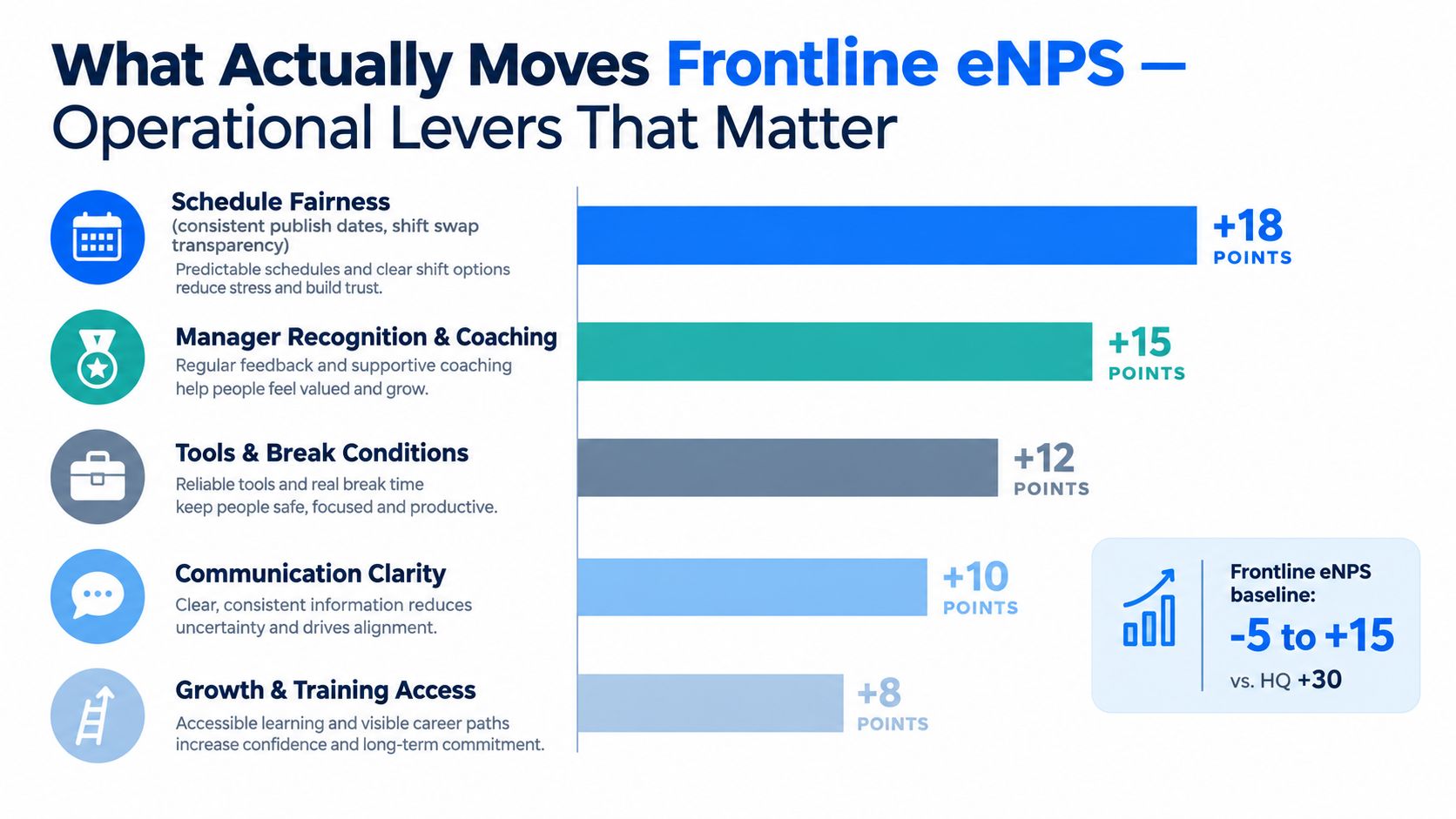
Operational conditions move frontline eNPS more than culture messaging does. If your score is weak, start with work design, manager quality, and communication reach before you start rewriting values statements.
A 2026 analysis of frontline engagement drivers points to fair pay, predictable scheduling, workload, manager quality, recognition, psychological safety, and career growth as the main levers. The same period’s Gallup-linked reporting cited there also put on-site workers at only 17% engaged, the lowest among work-location categories, in Turn On Work’s analysis of how to measure employee engagement on the frontline. That tells you something important. Low frontline eNPS often reflects operational reality, not a branding problem.
The levers worth your attention
Schedule fairness comes first more often than office-based leaders expect. If schedules are posted inconsistently, shift swaps are opaque, or favored employees get better patterns, people don’t need a survey to know the system is unfair.
Manager consistency is usually the second pressure point. Frontline work is intensely local. One strong district manager does not cancel out five weak site supervisors.
Recognition matters, but not in the generic sense. Broad appreciation campaigns don’t fix much. Specific recognition tied to visible behavior works better because it reinforces what the team should repeat.
Communication clarity is another major factor. A 2025 academic study of 22 healthcare and EMS managers found that effective frontline communication depended on both general and PPE-specific practices during preparedness and response, which reinforces a broader point from the NIH-hosted healthcare communication study. Frontline messaging has to match the hazard, timing, and task context of the work.
A short diagnostic after every survey wave
Ask local leaders these questions:
- What changed in scheduling over the last cycle
- Which managers have the highest detractor concentration
- What information failed to reach late, weekend, or overnight shifts
- Which comments point to fairness, not just frustration
- What can be fixed locally without waiting for corporate approval
If your action plan starts with “improve culture,” you probably haven’t diagnosed the problem.
The levers that look good in slides but rarely move frontline advocacy are the usual corporate comfort items: snack tables, slogan campaigns, and polished mission messaging. They don’t solve inconsistent staffing, unclear instructions, or supervisor behavior.
Common Frontline eNPS Mistakes and the TurnOnWork Action Loop
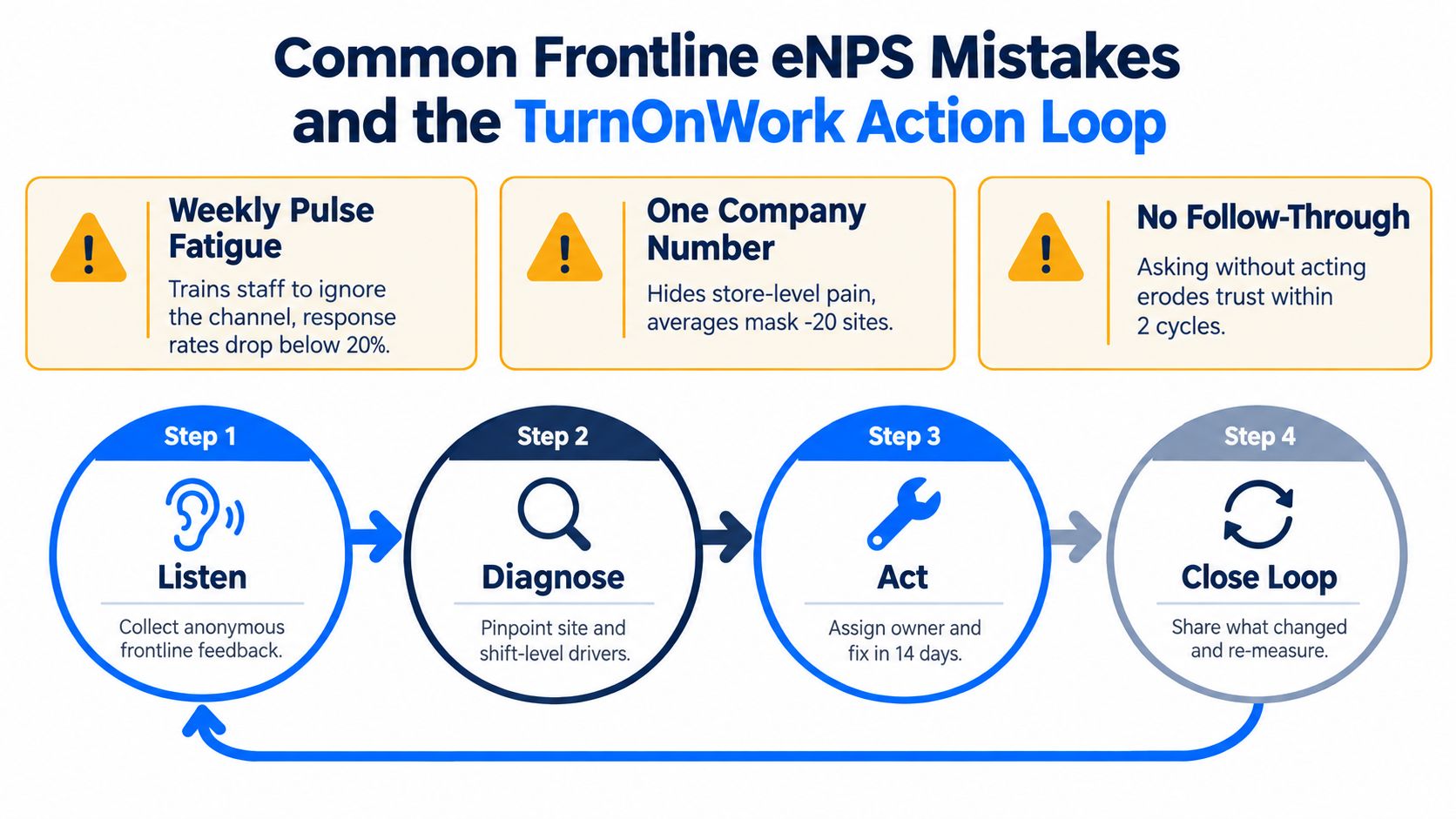
Most frontline eNPS programs fail because leaders chase a score instead of running a listening system. They over-survey, average away site-level pain, and treat employee Net Promoter Score like an end state instead of a signal.
The mistakes that quietly wreck the program
Over-surveying the same workforce
Weekly pulses sound modern. They usually create channel blindness. Frontline workers stop responding when every message feels urgent and none of it changes their day.
The fix is cadence discipline. Use a full-population quarterly rhythm for most frontline employee survey programs. Add targeted pulses only when a team has a live operational issue and a clear intervention path.
Reporting one company-wide number
An enterprise average can hide a healthy office population, a decent regional average, and a handful of damaged sites. That’s why a single score is often worse than useless. It can reassure executives while local teams are failing.
Use segmentation as a management requirement, not a reporting preference. At minimum, cut by location, shift, role family, and manager layer.
Chasing a target that has no context
A lot of leadership teams still ask for a “good eNPS score for employees” as if one answer exists across every workforce. It doesn’t. Context wins. Site movement wins. Driver resolution wins.
If your benchmark obsession causes teams to game communication, overexplain survey intent, or pressure staff to respond positively, you’ve already poisoned the data.
Treating eNPS as a standalone KPI
This is the oldest mistake. The score goes on a dashboard by itself, detached from turnover, absences, safety incidents, customer complaints, and staffing pressure. Then leaders wonder why nothing improves.
Published frontline guidance has already been clear on this point. Pair eNPS with operating outcomes and use it as a directional signal, not a standalone verdict.
The TurnOnWork Action Loop
Here’s the operating rhythm I recommend for enps frontline programs.
1. Listen
Run the core eNPS question with one or two open responses. Keep it accessible, mobile-friendly, and short enough that workers can complete it during real shifts.
2. Diagnose
Cut the results by shift, location, tenure, and manager. Then read comments for patterns around fairness, staffing, communication breakdowns, and supervisor behavior.
3. Act
Assign one manager-owned commitment per team per quarter. Not six. One. A frontline leader can fix scheduling communication, handoff consistency, or break coverage. They cannot fix everything at once.
4. Verify
Re-measure after a short action window. Publish what changed, what did not, and what will happen next. That last part matters. Silence between survey cycles teaches people that the survey was theatre.
If a frontline leader can’t name the last action taken from a detractor comment, the program isn’t listening. It’s performance.
Four frontline questions leaders still ask
What does a negative frontline eNPS mean
It means you have more detractors than promoters in that population. In frontline settings, that usually points first to fairness, supervision, workload, or communication failure. Start by reviewing the worst-performing sites and the manager groups attached to them this week.
What is a healthy response rate for deskless eNPS
There is no universal target worth copying blindly. What matters is whether your survey reaches all shifts and whether participation is stable enough to compare segments over time. Audit who is missing from the sample this week before arguing about the headline participation number.
How often should frontline eNPS run
For most organizations, quarterly is the right default for the full population. If a team is in visible distress, add a short monthly pulse with a narrow purpose and an action owner. Pick one struggling region this week and define a tighter cadence only there.
Can frontline eNPS replace an annual engagement survey
No. eNPS tracks advocacy and direction. It does not explain the full experience of work. Keep the annual survey for deeper diagnosis, and use eNPS between cycles to monitor movement and local risk. This week, map which topics belong in each instrument so teams stop overloading the pulse.
FAQs on eNPS for Frontline Teams
What is eNPS for frontline teams?
It’s the Employee Net Promoter Score used with deskless workers in settings like retail, healthcare, hospitality, manufacturing, logistics, and field operations. It asks how likely employees are to recommend the organization as a place to work and turns the answers into a score.
How do you calculate frontline employee eNPS?
Classify responses of 9 or 10 as promoters, 7 or 8 as passives, and 0 to 6 as detractors. Then subtract the percentage of detractors from the percentage of promoters. Passives are tracked but excluded from the final score.
What is a good eNPS score for employees on the frontline?
There isn’t one universal answer. General HR references often classify below 0 as weak, 10 to 30 as good, and above 50 as excellent, but frontline sectors often run lower than office-heavy populations. Compare against your industry and your own trend.
What’s the difference between eNPS and an engagement score?
eNPS measures advocacy. Engagement surveys measure the broader experience of work, including factors like manager support, workload, growth, communication, and trust. Use eNPS as a directional signal and engagement surveys for deeper diagnosis.
What are the best channels for a frontline employee survey without email?
SMS, mobile app delivery, QR codes, kiosks, and shared tablets are the most practical options. The right mix depends on whether workers use personal phones, work in restricted environments, or move across multiple sites.
Should eNPS be anonymous for frontline workers?
In most cases, yes. Anonymity helps reduce fear, especially where local manager behavior is part of the issue. What matters most is being explicit about privacy, access, and how comments will be routed.
Can eNPS improve frontline employee engagement on its own?
No. Measuring doesn’t improve anything by itself. eNPS only becomes useful when leaders use the feedback to fix scheduling, communication gaps, local supervisor issues, recognition practices, and other day-to-day operating conditions.
What is the biggest mistake in frontline workforce feedback programs?
Collecting data without acting on it. If workers keep answering surveys and see no visible changes, response quality and trust both fall.
If you’re building a frontline listening program, keep the standard simple and strict. Measure with channels workers actually use. Segment ruthlessly. Tie scores to operating conditions. Then make managers own one fix at a time. That’s how frontline eNPS stops being a vanity metric and starts becoming a workforce operations tool.